Victoria
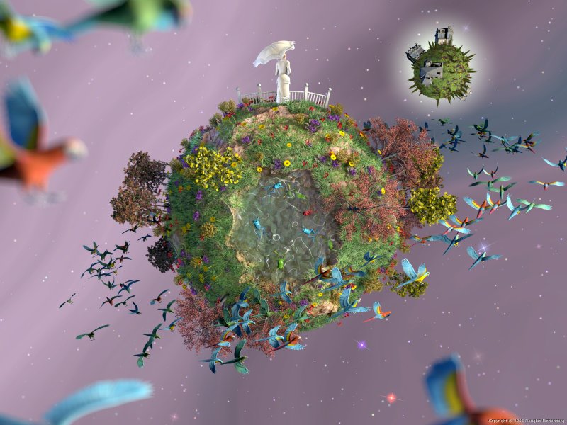
"Victoria's World" by Douglas Eichenberg - ranked equal 4th
[Order Poster from Zazzle]

A surreal take on 'Christina's World'

Prev - Index - Next ]
Long Description

After I completed the image I found that it reminded me of the Andrew Wyeth painting called "Christina's World." Since I used the Victoria model for the female figure, I decided to call it "Victoria's World." There's no interpretation consciously intended, but I can think of a few that are suggested by the image.

Making Of

BACKGROUND
The starry sky was created by applying a wrinkled color map to a hollow sphere. It was given a purely ambient finish and is not affected by any of the scenes lighting. The stars were randomly sized, colored, and placed with a macro, and created with Chris Colefaxes lens effects include file.
PLANETS
The planets are isosurfaces with an average texture map comprised of various rocky bitmaps applied. A second isosurface was subtracted from the main planet to make the crater that holds the water.
THE WATER
The water is an isosurface with an interior using color fading and photons. Highlights on the water were created with a turbulent pigment map.
THE FENCE
The fence is a simple POVRay CSG object which was UV-mapped with a couple of different image maps and bump maps to give it a weathered white-washed look.
THE GRASS
The grass was created with a simplified Gilles Trans MakeGrass macro and placed with a custom macro using trace and eval_pigment. There are 4 different types of grass used (2 tall and 2 short), each with a unique texture.
THE TREES AND FLOWERS
The trees and flowers were made in XFrog and exported as obj files for UV-Mapping in PoseRay. There are 3 different flower types (gerbera, violet, and hippeastrum) and 4 different tree types (spruce, maple, myrtle, and spanish broom). They were placed using the same macros used for the grass placement.
THE BIRDS AND FROGS
The birds and frogs were made and posed in Poser and UV-mapped/exported in PoseRay. There are 3 different frogs, and they were placed with a separate macro that detects areas where the water level is greater than the ground level. It also detects the depth of the water, and then places the frog within the water. The birds were placed with a macro that creates a ring-shaped mass of randomly selected birds. There were 3 different plumage types used and 3 different poses for each.
THE HOUSES
The houses are in the Victorian style and come from the Dosch collection. They were imported into NuGraf/PolyTrans and broken into pieces based on the textures to be used, then exported as obj files and UV-mapped for POV in PoseRay. They were placed manually as I was unhappy with any of the random combinations I came up with. They include a lit porchlight on the uppermost house, flaking paint on the siding, bumpy and broken shingles on the roofs, and (although you cannot make it out even in the detail view) condensation on the windows :P
THE FEMALE FIGURE
The female figure is the Victoria model from DAZ3D, with the 1890's vintage dress and umbrella, and Kozaburo hair. She was posed in Poser and uv-mapped/exported for POV in PoseRay.
LIGHTING
Lighting was done primarily with area spotlights created with a custom macro. Light groups were used for many of the objects. Radiosity was turned off for the rendering.
Tools Used

POVRay 3.5, XFrog 3.5, Poser 4, PoseRay 3.0.2.272, Picture Publisher 8, NuGraf/PolyTrans 2.2, Gilles Tran's MakeGrass macro,
Chris Colefaxes Lens Effects include file

Supplied Files

None

Detail Images

Detail 1: 1203x1263 @ 1300,460

Detail 2: 821x819 @ 1100,40
Judges Comments

Very imaginative picture (one of the most creative here with Song for the Earth), great concept and lots of cool, fun details. Good use of the SDL for positioning elements and "overdetailing" an image. On the minus side, the composition is a little off and the colouring could have used more development cycles: poorly contrasted greenish, greyish, reddish hues on a mauve background are not very attractive when seen from a distance.


A great show of POV-Ray's power and technically a very good image. In my mind there are a few things that could be improved artistically, mainly the composition of the image. If the camera was positioned closer to Victoria's World I feel the image would have had greater impact. The detail level is extremely high and there is good use made of POV-Ray's features, but the predominant use of external models (e.g. Victoria, the Dosch houses, Chris Colefax's Lens Effects include, Gilles Tran's MakeGrass) prevented it from making it further in my mind. The lighting is interesting and balanced, but I would suggest trying to increase the small-scale contrast as the details start to disappear without it when the image is viewed at smaller sizes. Overall, something to be proud of, and something you shouldn't stop working on now - try playing with a few different compositions and see what happens!


Very detailed, it was obvious a lot of care had been taken over this one. I actually liked the use of colour in this one a lot. The use of the birds and depth of fields helped give the image the feeling it was coming out of the screen. First rate effort.


This image has a kind of soft fairytale feeling to it. The attention to detail is excellent (the more you examine the image, the more details you discover). On the other hand, the image is not extremely impressive at a first glance at a small scale, which may diminish its wow-value. Also the average coloration of the image is perhaps a bit dull. But nevertheless a great image.

Prev - Index - Next ]
All entries and comments are copyrighted and the property of the author.
No content on this site may be used without appropriate permission.