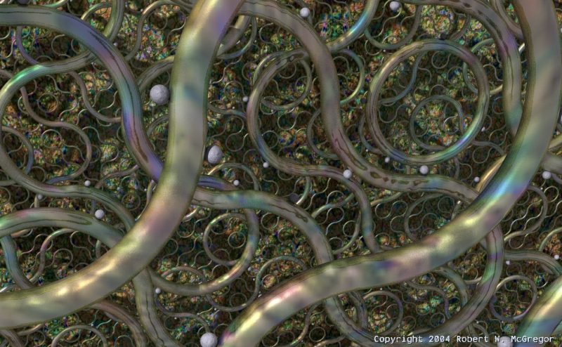
Making Pathways
Composition
The main idea for this piece was to allow POVRay to generate the scene composition based on a few simple rules by using non-periodic tiling of cubes containing two 90 degree slices of a torus. In a macro I set up an XY grid of these cubes, each rotated randomly either 0 or 90 degrees on the Z-axis. This simple trick (derived from work by a 17th-century Dominican monk named Sebastian Truchet) yields an intricate pattern of infinitely non-repeating, non-intersecting tubes.
For some additional eye candy, a sphere is placed on the surface of each torus section within each cube in the cube array, and these spheres are randomly rotated along the torus surface to give a more natural flow to the overall composition.
Shapes
The tubes are made of two 90-degree torus slices, with one end of each sliced torus "elbow" touching the center of a different cube face (the cubes themselves are invisible), like this:
#declare Cube =


box { -0.5, 0.5 pigment { rgb 0.25 transmit 0.75} finish { Shiny }}


#declare Slice =


difference {


   torus { 0.5, 0.05 }


   object { Cube scale x*1.5 translate z*0.5 }


   object { Cube scale z*1.5 translate x*0.5 }


}


#declare Tile = union {


   //object { Cube }


   object { Slice translate x*0.5 translate z*0.5 rotate z*90 rotate -y*90 }


   object { Slice translate x*0.5 translate z*0.5 rotate z*90 rotate y*90 rotate x*180 }


}
Materials
The background plane is textured using an abstract and very colorful image map pigment with an averaged granite normal.
For the tubes I also used an averaged normal. I used the background image map as a bump map and averaged this with two unique layers of granite, each having a diferent bump size and scale, and a pseudo-fractalized normal_map for a hammered effect, like this:
#declare N_Hammered = normal {

   bozo

   normal_map {

      [0.00 dents 0.05 scale 0.01]

      [0.15 dents 0.05 scale 0.001]

      [0.3 dents 300 scale 0.0005]

      [0.45 dents 0.02 scale 0.01]

      [0.5 bumps 0.07 scale 0.01]

      [1.0 dents 0.05 scale 0.005]

   }

}


#declare N_Tubes = normal {

   bump_map {

     png "ImageMap.png"

     map_type 1

     interpolate 2

     bump_size 0.5

   }

}


      normal {

         average

         normal_map {

            [ 1.5 N_Tubes ]

            [ 0.1 granite 0.5 scale 0.2 ]

            [ 0.1 granite 0.75 scale 0.12 ]

            [ 0.5 N_Hammered scale 2 ]

         }

      }
For the tube pigment I again used the background image map. This reuse of the image map as both normal and pigment throughout the scene really ties everything together into a cohesive whole. The spheres use a similar texture.
The final touch is my use of the golden ratio for the image size, giving the overall composition a pleasing sense of classical proportion. The deep shadows cast from the multiple layers of tubes onto the background plane add a sense of mystery to their intricate, colorful, and delicately pleasing geometries.


