Pirates
"Pirates" by 'seawolf' - ranked 6th
[Order Poster from Zazzle]

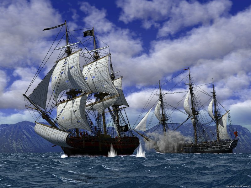
a pirate ship chased by a navy frigate

Prev - Index - Next ]
Long Description

I'm very interested in historic maritime subjects. Therefore I choose a nautic scene for the competition.

There are several areas of complexity;

  • water and waves
  • sky and clouds
  • land and haze at the horizon
and of course a ship with enough detail.
Making Of

frigate;
A conventional model constructed with Moray. The sails use uv-mapped image maps.
gun smoke;
A media object with density file.
clouds;
A single media object with a density file based on granite pattern.
sea;
A grid of heightfields with seamless texture. The heightfield was created with a special generator program. The generator builds a sequence of fractal wave like curves and connects them by a fractal plane.
island;
A heightfield plus media object to simulate haze.
Light;
There is just a point light and a small area light for the sun plus radiosity.
Tools Used

Tools used;
- POV-Ray 3.6 official version for rendering
- Moray 3.5 for modeling all objects in scene
- Photoshop for creation of imagemaps especially for sails
- POV-Ray to create image slices of density files for clouds
- tga2df3.exe by PodD to transform image slices into density files
- World Maschine 0.99 beta by Stephen schmitt (Shareware) for hightfield of island
- a java utility I wrote myself to create heightfields for the sea surface

Objects;
The scene uses a model of an english fregate that I have been working on for some time. An earlier version was used in some scenes published at Zazzle.
For the competition is has been enhanced with different sails, crew, guns, and textures.

Supplied Files

None

Detail Images

Detail 1: 1077x808 @ 331,528

Detail 2: 1076x807 @ 1225,771
Judges Comments

Possibly the top of what can be done presently in terms of marine images. Incredible ship modelling, water and clouds. On the minus side: the characters look like Playmobil toys and the warfare atmosphere is way to calm. Better not compare it to paintings of similar topics by Turner, Hogarth, Scott and all...


The composition and motion in this scene is great. A good job has been done of making the ships appear grand and imposing without destroying the feeling of space. The waves have a very painted feel to them, like thick brush strokes in acrylic. Their deep colour and sharp cusps induce a feeling of danger. The ships are very well modelled but in a few places at large rendering sizes some minor problems are visible. This does not detract from the overall image however. The only thing that could have used a little more work is the mountain range, but the foreground makes up for it.


Great image, very powerful. Has the presence of a great oil painting rather simply a computer generated image. Use of smoke and spray very effective, ships actually look like they are really in the water. Red flag looked a little odd, possibly needed a bit more work on the crew, especially in the positioning. Very admirable effort nonetheless, definitely an image, or idea, that could be taken further.


Good photorealism and modelling. The attention to detail is mostly excellent, even though in some places a high-resolution render starts to show lack of detail (for example the sailors). The clouds and the water are excellent, and although the mountains could have used some more detail and photorealism, they don't really bother me. The red flag is perhaps waving in the wrong direction compared to everything else, but that's just a minor detail. The image has a sense of action in it, which is commendable.

Prev - Index - Next ]
All entries and comments are copyrighted and the property of the author.
No content on this site may be used without appropriate permission.